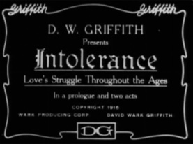
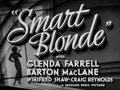
In the era of silent film, film titles were printed on letter cards (or inter-titles), which provided context. These cards were the responsibility of the lettering artist, who collaborated with the scriptwriter and director to create narrative continuity so that audiences could follow what they were seeing. Distinct from these inter-titles was the film’s main title, which mainly concerned film producers because of the legal, copyright and marketing information this footage had to bear. Among the fonts often adopted for titles and inter-title cards were Pastel, National Old Style and Photoplay (Samuel Welo’s Studio, 1927).

In the 1930’s the film studios began to invest more into opening tittles and produced sound and more time and money was spent on making a good opening title. The traits where still the same, making the tittle of the film key and the directors name still large. One example of this is The Women made in which was directed by George Cukor.

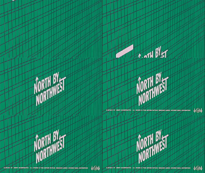
As the 20th century progressed the opening tittles began to use a lot more graphic design and illustrations became more contemporary. Also because of improved editing software filmmakers where able to make more aesthetically pleasing opening titles. A larger proportion of the budget was also dedicated to making better opening titles. These progressed tittles are shown in North By Northwest directed by Saul Bass.

In gone with the wind (1939) the opening titles featured moving pictures of the actors. Soon after this opening sequences became more artistic and computer technology allowed the film industry to take a large step toward what we see in modern day films.
Nowadays title sequences are presented in new, exciting and innovative ways and are able to become integrated within the film or fit the mood of it. Examples of this include Se7en (1995) and Catch Me If You Can (2002).
